Date Picker
The Date Picker field type is designed to automatically interact with calendar interfaces and date selection components. When a form field opens a calendar and expects users to select a date, you can configure this field type to automatically select the desired date without manual intervention.
INFO
This field type is generally used when the standard Date Form Field is not working or when dealing with custom calendar implementations.
Overview
The Date Picker field type provides comprehensive automation for various calendar interfaces, supporting multiple date picker libraries and custom implementations. It handles complex calendar navigation, date selection, and form integration seamlessly.
Key Features:
- 📅 Calendar Navigation - Navigate through months and years
- 🎯 Date Selection - Automatically select specific dates
- 🔄 Multiple Library Support - Works with various date picker libraries
- ⚙️ Custom Configuration - Flexible setup for different calendar types
- 🎨 Visual Calendar Support - Handles both input-based and visual calendar interfaces
Field Configuration Options
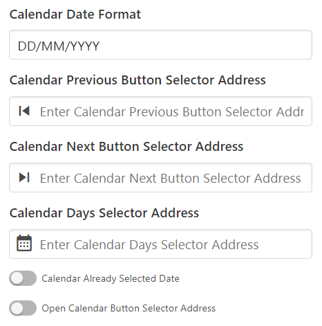
📅 Calendar Date Format
Specifies how dates are displayed in the calendar interface.
Purpose:
- Format Recognition - Tells the extension how to interpret calendar dates
- Date Matching - Ensures correct date selection based on format
- Library Compatibility - Matches the specific date picker library format
Common Formats:
YYYY-MM-DD- 2024-01-15DD-MM-YYYY- 15-01-2024MM/DD/YYYY- 01/15/2024DD/MM/YYYY- 15/01/2024
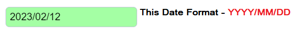
Format Reference: For complete format options, refer to the Day.js format documentation.
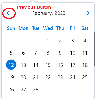
⬅️ Calendar Previous Button Selector Address
Defines the CSS selector for the button that navigates to the previous month.
Configuration:
- Selector - CSS selector for the previous month button
- Navigation - Enables month-by-month navigation
- Compatibility - Works with different calendar implementations
Common Selectors:
.prev- Simple class-based selector[data-action="prev"]- Data attribute selector.calendar-nav .prev- Nested selector
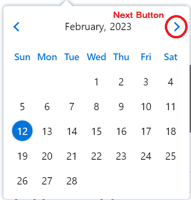
➡️ Calendar Next Button Selector Address
Defines the CSS selector for the button that navigates to the next month.
Configuration:
- Selector - CSS selector for the next month button
- Navigation - Enables forward month navigation
- Year Navigation - Supports year-over-year navigation
Common Selectors:
.next- Simple class-based selector[data-action="next"]- Data attribute selector.calendar-nav .next- Nested selector
📆 Calendar Days Selector Address
Specifies the container element that holds all selectable days in the calendar.
Configuration:
- Container Selector - Element containing all day elements
- Day Elements - Individual day selectors within the container
- Selection Logic - How days are identified and selected
Common Selectors:
.calendar-days- Container for all days.day:not(.disabled)- Selectable days onlytd:not(.disabled)- Table cell days
📝 Calendar Already Selected Date
Handles scenarios where the date picker doesn't automatically populate the input field after date selection.
Problem: Some date pickers insert the selected date into the input field automatically, while others require manual input field population.
Solution:
- Date Detection - Identify the currently selected date in the calendar
- Input Population - Manually fill the input field with the selected date
- Format Matching - Ensure date format matches input field requirements
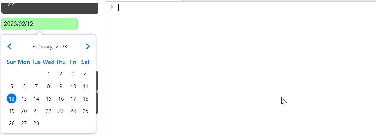
Example: If the calendar shows 2023-04-22 as selected, configure this option to populate the input field with the same date.
🔄 Generate Calendar Already Selected Date
Creates a calendar interface with a pre-selected date when the selected date changes dynamically. This feature allows you to configure how the extension identifies and handles already selected dates in the calendar.
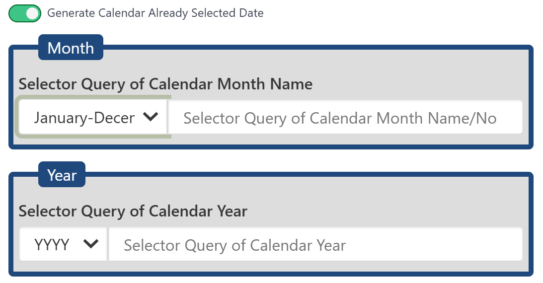
Use Cases:
- Dynamic Calendars - When calendar selection changes frequently
- Pre-populated Forms - Forms with existing date values
- State Management - Maintaining calendar state across interactions
📅 Month Configuration
Configure how the extension identifies the month in the calendar interface.
Month Format Options:
| Month Format | Description | Example Values |
|---|---|---|
| January-December | Full month names | January, February, March, etc. |
| Jan-Dec | Abbreviated month names | Jan, Feb, Mar, etc. |
| 01-12 (MM) | Two-digit month numbers with leading zeros | 01, 02, 03, etc. |
| 1-12 (M) | Single-digit month numbers | 1, 2, 3, etc. |
Selector Configuration:
- Month Selector Query - CSS selector or XPath to locate the month element
- Format Matching - Select the format that matches your calendar's month display
📆 Year Configuration
Configure how the extension identifies the year in the calendar interface.
Year Format Options:
| Year Format | Description | Example Values |
|---|---|---|
| YYYY | Four-digit year format | 2024, 2023, 2022, etc. |
| YY | Two-digit year format | 24, 23, 22, etc. |
Selector Configuration:
- Year Selector Query - CSS selector or XPath to locate the year element
- Format Matching - Select the format that matches your calendar's year display
🔘 Open Calendar Button Selector Address
Handles date pickers that require clicking a separate button to open the calendar interface.
Scenario: When clicking the input field doesn't open the calendar because it's controlled by a separate button.
Configuration:
- Button Selector - CSS selector for the calendar trigger button
- Click Simulation - Automatically click the button to open calendar
- Timing Control - Wait for calendar to open before proceeding
Common Selectors:
.calendar-trigger- Button class selector[data-toggle="calendar"]- Data attribute selector.date-picker-button- Specific button class
⏱️ Set the wait time between Previous/Next month Action
Configures the delay between month navigation actions to ensure proper calendar loading.
Purpose:
- Calendar Loading - Allow time for calendar to update
- Animation Completion - Wait for month transition animations
- Element Stability - Ensure new month elements are fully loaded
Configuration:
- Delay Time - Milliseconds to wait between actions
- Custom Timing - Adjust based on calendar performance
- Reliability - Prevent timing-related errors
✅ After picking the date, press the button to set the date in form
Specifies a button that must be clicked after date selection to confirm and set the date in the form.
Use Cases:
- Confirmation Required - Calendars that require explicit confirmation
- Form Integration - Buttons that trigger form updates
Configuration:
- Button Selector - CSS selector for the confirmation button
- Click Action - Automatically click after date selection
Supported Date Picker Libraries
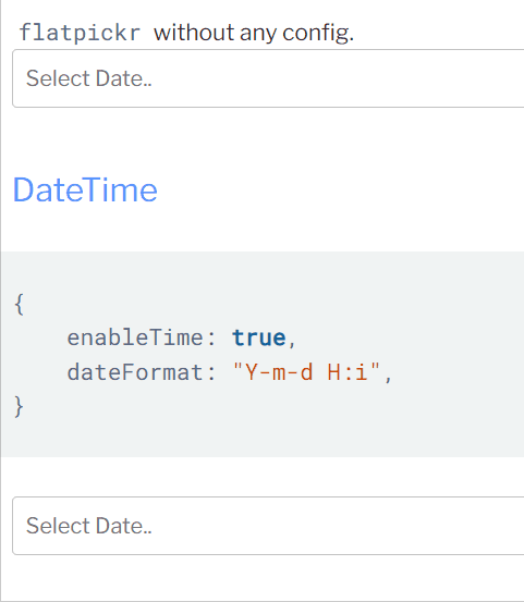
📚 flatpickr
A lightweight, powerful date picker library with extensive customization options.
Configuration:
- Event Trigger - Set only one JavaScript event:
change - Format Support - Supports multiple date formats
- Customization - Highly customizable appearance and behavior
flatpickr Configuration
If using flatpickr date picker, set only one JavaScript event change in the field settings for optimal performance.
Library Link: flatpickr on GitHub
📅 date-picker
A modern, accessible date picker component with clean design.
Features:
- Accessibility - Built with accessibility in mind
- Modern Design - Clean, contemporary interface
- Customization - Flexible styling options
Library Link: date-picker on GitHub
📊 react-multi-date-picker
A React-based date picker with multi-date selection capabilities.
Features:
- Multi-Selection - Select multiple dates
- React Integration - Built for React applications
- Advanced Features - Range selection, disabled dates, etc.
Library Link: react-multi-date-picker on GitHub
📈 daterangepicker
A jQuery plugin for selecting date ranges with advanced features.
Current Limitations:
- Auto-filling - Not currently supported for automatic date filling
- Manual Implementation - Requires JavaScript for date setting
daterangepicker Configuration
Note: Auto date filling is not currently supported for this field type.
Manual Date Setting: Use JavaScript to set the date value in the input field:
var dateInput = $("dateInputQuery");
if (dateInput) dateInput.data("daterangepicker").setStartDate("12-30-2024");
Date Picker Selector Queries:
- Previous Button:
div.drp-calendar[style*="display: block;"] table th.prev - Next Button:
div.drp-calendar[style*="display: block;"] table th.next - Days Selector:
div.drp-calendar[style*="display: block;"] table tbody td:not(.week):not(.off)
Library Link: daterangepicker.com
Configuration Best Practices
🎯 Selector Configuration
- Test Selectors - Always test CSS selectors in browser developer tools
- Specific Selectors - Use specific selectors to avoid conflicts
- Dynamic Content - Account for dynamically loaded calendar elements
- Fallback Options - Provide alternative selectors for different calendar states
⏱️ Timing Considerations
- Calendar Loading - Allow sufficient time for calendar to load
- Animation Delays - Account for transition animations
- Element Stability - Wait for elements to be fully rendered
- User Experience - Balance speed with reliability
🔧 Error Handling
- Element Detection - Verify all required elements are present
- Date Validation - Ensure selected dates are valid
- Format Matching - Match date formats between calendar and input
- Fallback Actions - Define actions when date selection fails
Troubleshooting
❌ Common Issues
Issue: Calendar doesn't open Solutions:
- Check the "Open Calendar Button Selector" configuration
- Verify the input field selector is correct
- Ensure the calendar trigger button is properly identified
Issue: Date not selected correctly Solutions:
- Verify the "Calendar Days Selector" configuration
- Check the date format matches the calendar display
- Ensure the target date is available in the current month view
Issue: Date not populated in input field Solutions:
- Configure "Calendar Already Selected Date" option
- Check if a confirmation button needs to be clicked
- Verify the input field selector is correct
🔧 Advanced Troubleshooting
Issue: Month navigation not working Solutions:
- Verify Previous/Next button selectors
- Check timing between navigation actions
- Ensure calendar elements are fully loaded
Issue: Date format mismatches Solutions:
- Review "Calendar Date Format" configuration
- Match the format used by the specific date picker library
- Test with different date formats
Next Steps
- Field Settings - Configure advanced field options
- Field Types - Explore other field types
- Variables - Use variables for dynamic dates
- Form Configuration - Set up complete form automation
Tips and Tricks
💡 Pro Tips
- Test with Sample Dates - Always test with various date formats and ranges
- Use Browser Tools - Leverage developer tools to identify correct selectors
- Handle Edge Cases - Test with leap years, month boundaries, and disabled dates
- Monitor Performance - Adjust timing settings for optimal performance
- Document Configurations - Keep track of working configurations for different calendar types
🚀 Advanced Features
- Dynamic Date Generation - Use variables to generate dynamic dates
- Conditional Date Selection - Select dates based on specific conditions
- Range Selection - Handle date range pickers with multiple dates
- Custom Calendar Integration - Adapt to proprietary calendar implementations