Material Multiple Select
The Material Multiple Select field type is designed to handle modern, custom dropdown components in web applications that support multiple selections (such as tags, chip lists, or checkbox-based dropdown options built with Vuetify, Material-UI, React-Select, PrimeNG, etc.).
It allows selecting multiple values from a single cell by splitting values with a configurable delimiter (e.g. comma ,).
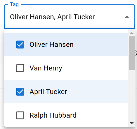
Field Options
| Option | Description |
|---|---|
| Separator to Split Value | Character used to split multiple values from a single Excel cell (e.g. ,, ;, |). |
| If the dropdown has to be opened repeatedly while doing multiple selection, then keep this option on | Automatically reopens the dropdown menu between selections if picking an item closes the popup. |
| Match options as | Determines how field values are compared against dropdown options (Equal to Name, Search Name in Any Position, or Match Name from Start-End Position). |
| External Library Name | Select a pre-configured library preset (e.g., MUI, React Select, Chosen). If your library is unlisted, select Other Material Library. |
| Wait until max options in the dropdown element | Waits for all option elements to finish rendering in the DOM before matching values. |
| Convert the text into lowercase letters and then match the text | Converts both cell values and option text to lowercase for case-insensitive matching. |
| Remove extra space from option text then match the text | Normalizes multiple consecutive spaces into a single space before comparison. |
| Remove all space from option text then match the text | Strips all spaces from option text before comparison. |
| Waiting time after dropdown is open | Sets a delay (in milliseconds) after opening the dropdown before selecting options. |
| If this field is to select text after the search | Enables search-and-select workflow: types each keyword into the search input first, then clicks the matching option from the filtered results. |
| Before selecting the dropdown option, check that option is already selected? | Checks whether an option is already selected before clicking it, avoiding accidental unselection. |
| Before selecting the dropdown option, uncheck the already selected options | Clears previously selected items before selecting new ones. |
| Trigger event on dropdown matched option | Dispatches standard DOM events (such as click or change) on each selected option element. |
| Trigger event for open dropdown option list | Dispatches required mouse events to open the dropdown menu. |
| After choosing the dropdown option, don't close the dropdown | Keeps the dropdown open after all selections are completed. |
Separator to Split Value
In bulk automation, multiple target values for a single dropdown are often stored together in one .xlsx Excel column cell.
- Default Separator:
,(Comma) - Example Cell Value:
Electronics, Home & Kitchen, Sports - Behavior: The extension parses the string into three distinct values:
ElectronicsHome & KitchenSportsEach value is matched and selected sequentially.
Tip: If your option labels naturally contain commas (e.g.,
"Washington, D.C."), change the separator to a semicolon (;) or vertical bar (|) and format your Excel cells accordingly (e.g.,Washington, D.C. ; New York, NY).
Repeated Dropdown Opening
Some custom dropdown components automatically close their menu popup immediately after an option is clicked.
- Option Enabled: If the dropdown closes after selecting the first item, the extension will automatically re-trigger the open action before attempting to match and select the next item.
- Option Disabled: The dropdown remains open across multiple clicks, allowing the extension to click all matching items in one pass.
Match Options as
| Matching Strategy | Description | Example Behavior |
|---|---|---|
| Equal to Name | Exact match only. | Value "Tech" matches "Tech" but not "Technology". |
| Search Name in Any Position | Substring match anywhere in the label. | Value "Tech" matches "High Tech Gadgets". |
| Match Name from Start-End Position | Full-string match from start to end. | Strict label match across the entire element. |
Search and Select (Select Text After Search)
For searchable multi-select comboboxes (such as tagging inputs where you must search to filter options):
- Set the field's Field Selector Query to the combobox input element.
- Provide delimited values in your Excel
.xlsxsheet (e.g.,Apple, Banana, Mango). - Enable "If this field is to select text after the search".
- For each item:
- The extension types the keyword into the input box.
- Waits for filtered results to populate.
- Clicks the matching item.
- Clears or resets the search input before typing the next keyword.
External Library Name
Predefined drivers are available for:
- Material-UI (MUI)
- React-Select
- Chosen
- Vuetify
- PrimeNG
- Kendo UI
- ng-multiselect-dropdown
Other Material Library
For unlisted or custom multi-select components:
| Query Field | Required | Description | Example |
|---|---|---|---|
| Dropdown Options List Query | Yes | CSS selector for option elements in the opened menu. | div.multi-select-menu > div[role="option"] |
| Dropdown Open Element Query | No | Selector for the button or trigger that opens the menu. | .dropdown-toggle-button |
| Dropdown Close Element Query | No | Selector for closing the dropdown menu. | .backdrop-overlay |
| Selected Value Element Query | No | Selector for the selected chips/tags container. | .selected-chips-container |
Library Setup Snippets
MUI Multi-Select & Autocomplete
- Dropdown Options List Query:
ul.MuiAutocomplete-listbox > li[role="option"] - For checkbox-based selections inside menus:
ul.MuiMenu-list > li[role="option"] - Library reference: MUI Autocomplete Multi-select
React Select
- Dropdown Options List Query:
div[class*='-menu'] div[class*='-option'] - Open Trigger: Trigger JavaScript event
['mousedown', 'click']on selectordiv[class*='-indicatorContainer']. - Library reference: React Select
Note on Kendo UI
When automating Kendo UI multi-select dropdowns, do not enable the field's JavaScript Event option, as Kendo UI manages event bindings internally.