Material Single Select
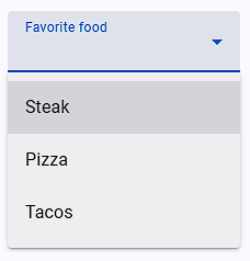
The Material Single Select field type is designed to handle modern, custom dropdown and combobox components in web applications (such as Vuetify, Material-UI (MUI), React-Select, Angular Material, PrimeNG, Chosen, and Kendo UI).
Unlike native HTML <select> tags, modern material UI frameworks render dropdowns using custom DOM structures (<div>, <ul>, <li>, <span>) with dynamic search inputs and animations. This field type provides automated search, option matching, and selection handling for single-choice dropdowns.
Field Options
| Option | Description |
|---|---|
| Match options as | Determines how the field value is compared against dropdown option labels (Equal to Name, Search Name in Any Position, or Match Name from Start-End Position). |
| External Library Name | Select a pre-configured library preset (e.g., MUI, React Select, Chosen). If the library is not listed, select Other Material Library. |
| Wait until max options in the dropdown element | Waits for all dropdown option elements to finish rendering in the DOM before attempting to match. |
| Convert the text into lowercase letters and then match the text | Converts both the target value and dropdown option text to lowercase for case-insensitive matching. |
| Remove extra space from option text then match the text | Normalizes multiple consecutive spaces into a single space before comparison. |
| Remove all space from option text then match the text | Strips all spaces from option text before comparison (useful for formatted or padded items). |
| Waiting time after dropdown is open | Sets a delay (in milliseconds) after the dropdown opens to allow animations or asynchronous options to load. |
| If this field is to select text after the search | Enables search-and-select workflow: types the search query into the combobox input first, then selects the matching item from the filtered list. |
| Before selecting the dropdown option, check that option is already selected? | Verifies whether the option is already selected before attempting a click, preventing unwanted toggle-offs. |
| Before selecting the dropdown option, uncheck the already selected options | Unselects any currently selected option before choosing the new one. |
| Trigger event on dropdown matched option | Dispatches standard DOM events (such as click or change) on the matched option element. |
| Trigger event for open dropdown option list | Dispatches required mouse events to trigger the dropdown menu to open. |
| After choosing the dropdown option, don't close the dropdown | Keeps the dropdown popup open after selection (useful for chained form interactions). |
Match Options as
Defines the text comparison strategy used to identify the target option:
| Matching Strategy | Description | Example Behavior |
|---|---|---|
| Equal to Name | Exact match only. | Value "Sales" matches "Sales" but not "Sales Department". |
| Search Name in Any Position | Substring match anywhere in the label. | Value "Sales" matches "International Sales Team". |
| Match Name from Start-End Position | Matches the entire text from start to end, ignoring minor punctuation. | Strict full-string comparison across the entire option element. |
Search and Select (Select Text After Search)
Many modern dropdowns (like autocomplete comboboxes or searchable select fields) require users to type a query first before the desired option appears in the list.
How It Works
When "If this field is to select text after the search" is enabled:
- Target the Search Input: Set the field's Field Selector Query to the dropdown's
<input>element (e.g.input[role="combobox"]or.select-search-input). - Enter Field Value: Provide the search keyword (from your
.xlsxExcel column or default value). - Automated Search Execution:
- The extension clicks the input element and types the search text character-by-character.
- It triggers necessary
inputandkeyupevents to activate autocomplete filtering.
- Automated Selection:
- Once the options list updates, the extension searches the rendered options for the matching text according to your Match options as rule.
- It clicks the matched option to complete the selection.
Example Configuration
- Field Type:
Material Single Select - Field Selector Query:
input.MuiAutocomplete-input - Field Value:
California - If this field is to select text after the search:
ON - Dropdown Options List Query:
ul.MuiAutocomplete-listbox > li
External Library Name
The extension includes built-in driver presets for popular JavaScript UI frameworks:
- Material-UI (MUI)
- React-Select
- Chosen
- Vuetify
- PrimeNG
- Kendo UI
- ng-multiselect-dropdown
Other Material Library
If your web page uses a custom dropdown component or an unlisted library, select Other Material Library and configure the selector queries:
| Query Field | Required | Description | Example |
|---|---|---|---|
| Dropdown Options List Query | Yes | CSS selector targeting the option elements in the opened menu. | ul.dropdown-menu > li[role="option"] |
| Dropdown Open Element Query | No | CSS selector for the button or trigger icon that opens the menu. | .dropdown-arrow-icon, .select-trigger |
| Dropdown Close Element Query | No | Selector for closing the dropdown menu if needed. | .modal-backdrop, .close-btn |
| Selected Value Element Query | No | Selector that displays the currently selected label. | .selected-value-text |
Library Setup Snippets
MUI Autocomplete
- Dropdown Options List Query:
ul > li.MuiAutocomplete-option - Library reference: MUI Autocomplete Documentation
MUI Select
- How to open MUI Select via JavaScript event:js
let event = new MouseEvent("mousedown", { view: window, bubbles: true, cancelable: true, }); document.querySelector("input").parentNode.querySelector("div").dispatchEvent(event); - Dropdown Options List Query:
ul.MuiMenu-list > li[role="option"] - Close already opened options query:
div.MuiModal-root[role='presentation'] > div
React Select
- Dropdown Options List Query:
div[class*='-menu'] div[class*='-option'] - Open Dropdown: Use field JavaScript Event
['mousedown', 'click', 'mouseup']on selectordiv[class*='-indicatorContainer']. - Library reference: React Select Documentation
Chosen Dropdown
- Use field JavaScript Mouse Event
['mouseup']. - Library reference: Chosen Documentation
Note on Kendo UI
When automating Kendo UI dropdowns, do not enable the field's JavaScript Event option, as Kendo UI handles its own synthetic event listeners.